Spring brings you a wider range of colors and you should choose some of them based on your needs to welcome this amazing season. Many people transform their interior design decor with significant changes that can positively affect one’s mental health. Home decoration is influenced by spring color palettes and that’s why you have to know the most common and popular ones if you want to make the best decision. This blog explains everything you need to know if you want to bring new life into your home decoration with seasonal color ideas.
Best Color Palettes for Spring to Freshen Up Your Decor
Bold and Bright
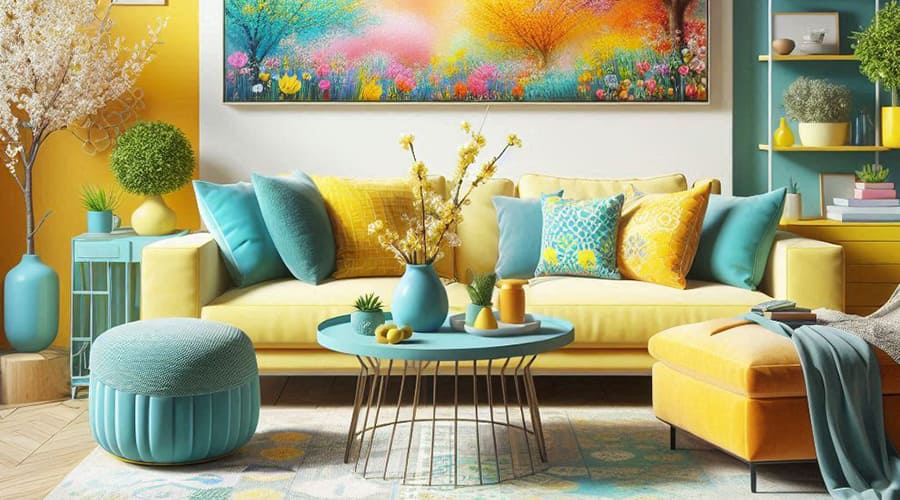
Spring is known because of its vibrant energy. That’s why professionals highly recommend considering bold and bright colors such as lemon yellow or electric blue to show the vibrant spirit, vitality, and dynamism of spring. If you want to feel more energetic and vibrant in your space, you need to consider this color palette.
Floral Insight
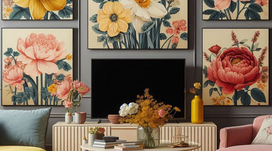
If you are looking for a floral aesthetic, you can choose this type of inspiration, which includes daffodil yellow, peony pink, or poppy red. These types of flowers indicate the spring and bring life to your space. You can also consider using wall art textiles or vintage accessories if you choose floral color palettes.
Sun Kissed Tones
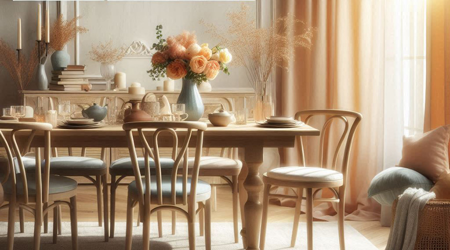
Sometimes, you can choose faded and sun-washed colors to display the muted beauty of spring. Colors like peach, faded denim, soft yellow, or coral can provide you with a sense of elegance and warmth because they remind you of the beautiful sunlight of a spring afternoon. You must consider a sun-washed palette if you seek a cozy, inviting space.
Tropical Brilliance
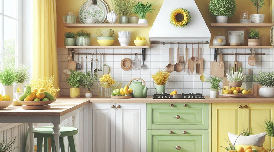
If you’re an adventurous person, colors like sunny yellow or lime green can meet your expectations. These tones provide you with a sense of vibration and boldness.
Cute Pastel Palette
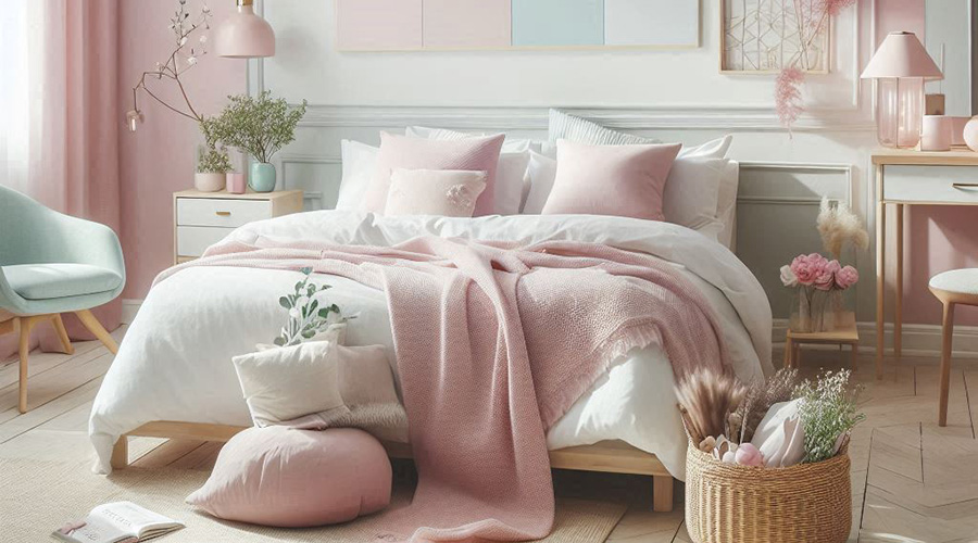
A delicate pastel color palette is an indication of spring, providing you with a calm and serene ambiance. You can choose soft lavenders, soft pinks, and mint greens to achieve this pastel aesthetic. If you want to have a full focus in your room and are also looking for a change because spring has come, this color palette can be a wise choice.
Neutral Tones
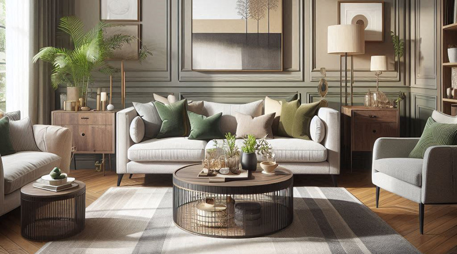
This palette is inspired by nature’s rebirth and includes colors like rich beige, mossy green, soft gray, etc. If you’re a nature person, these earthy neutral tones can satisfy your needs by providing a sense of calmness and stability. Somehow, you can bring nature into your home by choosing these color tones.
Refreshing Colors
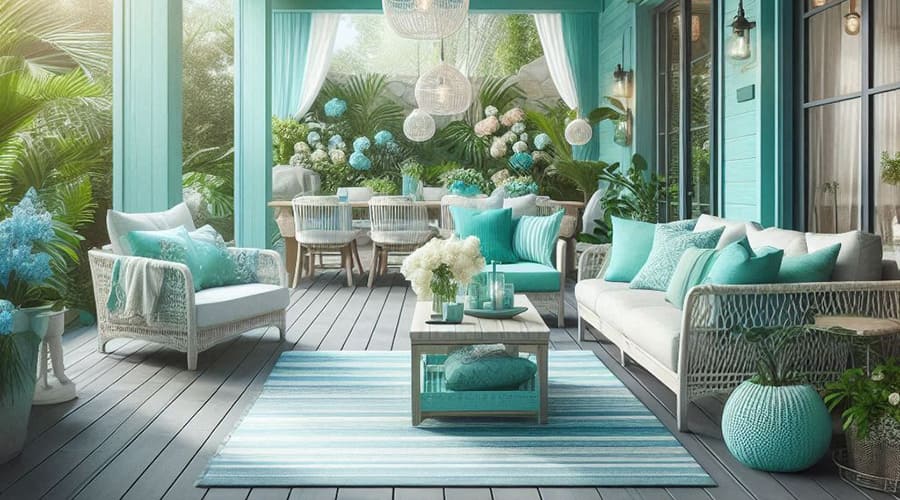
If you want to feel fresh whenever you wake up in the spring morning, you should go for cool and refreshing colors. This palette involves seafoam green, sky blue, and light aqua. If you choose these tones for your room, you can expect to feel more invigorating since it reflects the rejuvenation of spring.
What Are the Most Popular Colors Generally?
If you want a straightforward list of the most popular colors you can consider this spring, we are here to help you.
- Purple
- Orange
- Pink
- Yellow
- Blue
- Green
Each color is offered in different shades and intensities that you should pick based on your needs.
Adding Seasonal Colors to Each Area of Your Home
Now that you have basic information about the most popular color palettes for spring, you should understand how each group of tones is determined for a specific home area. Generally speaking, everything can be designed according to your personal preferences but professionals have some recommendations when it comes to seasonal colors for each room of your home.
Breakfast Nook
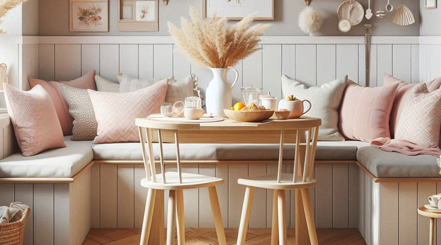
Using seasonal colors such as soft pink or white together for your breakfast Nook area can boost the overall look of your kitchen. You can also consider placing a shelf or pillows on the bench seats to improve your kitchen decoration.
Living Room
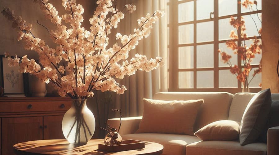
Pastel pink pillows are the trend of this spring for your living room design. Moreover, you can consider using faux cherry blossoms that can soften your living room look and provide it with a new brilliance.
Kitchen
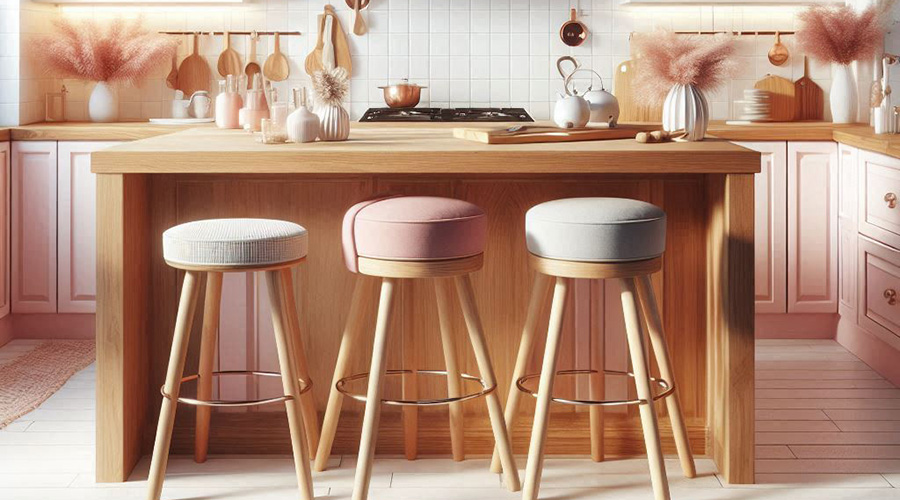
Still, the combination of pink and white is the most popular seasonal color among people this spring. Also, the aesthetic of wood can change the game and you can bring a quality barstool kitchen to add more value to your design.
Dining Room
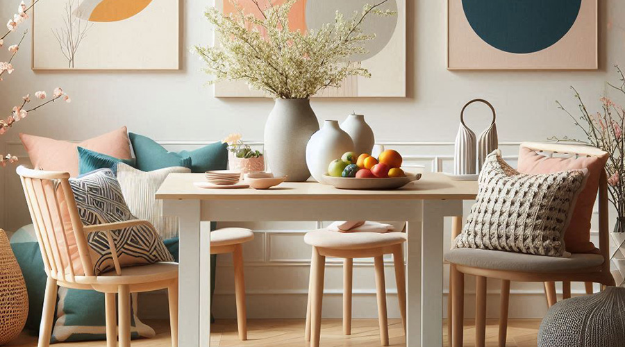
It’s highly recommended to go for bolder and brighter colors and also use soft pillows with ceramic vases to complete the look.
Final Thoughts
Each color palette can be adapted to different interior designer styles. No matter if you have chosen a cozy country or minimal design for your home, the right combination of these colors can meet your functional needs. The right decision can enhance your mood and provide your home with a more welcoming atmosphere.


